
Alle pagina's
1
Getting started with Magzmaker
Introduction and overview
2
Quickstart
Get started with Magzmaker in 5 steps
3
Editions
Edit edition, create a new edition, edition settings
4
Pages and templates
Create or copy a new page, save page as template, page settings
5
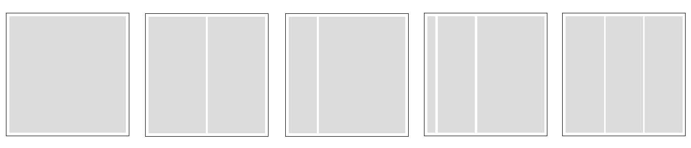
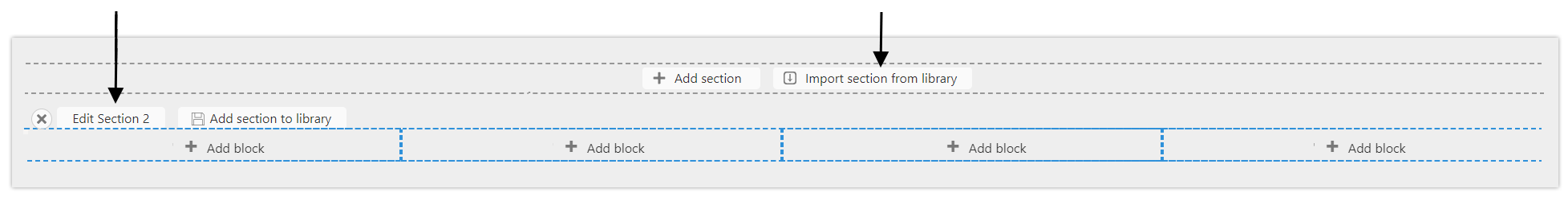
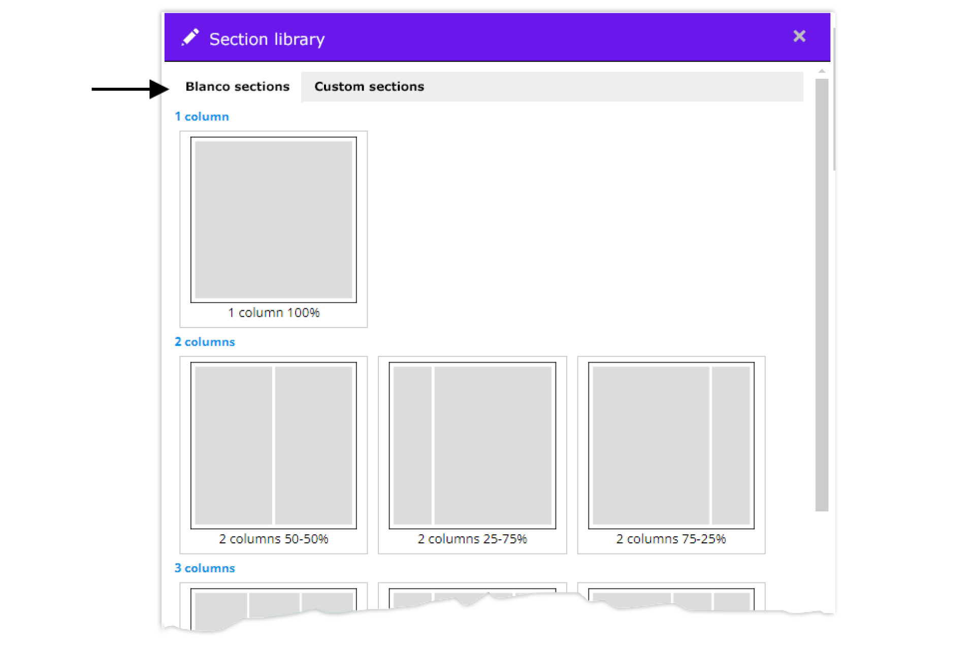
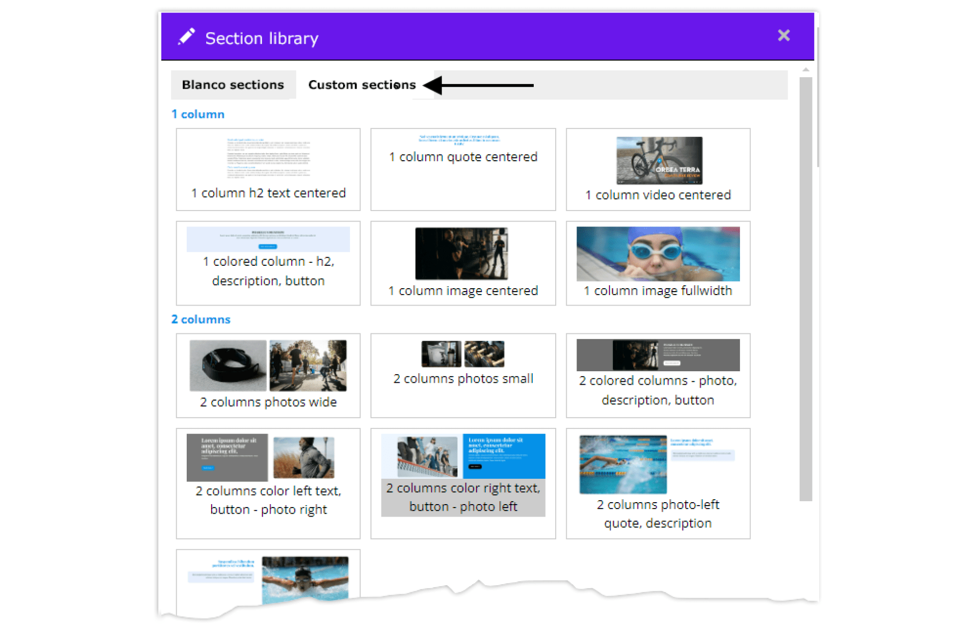
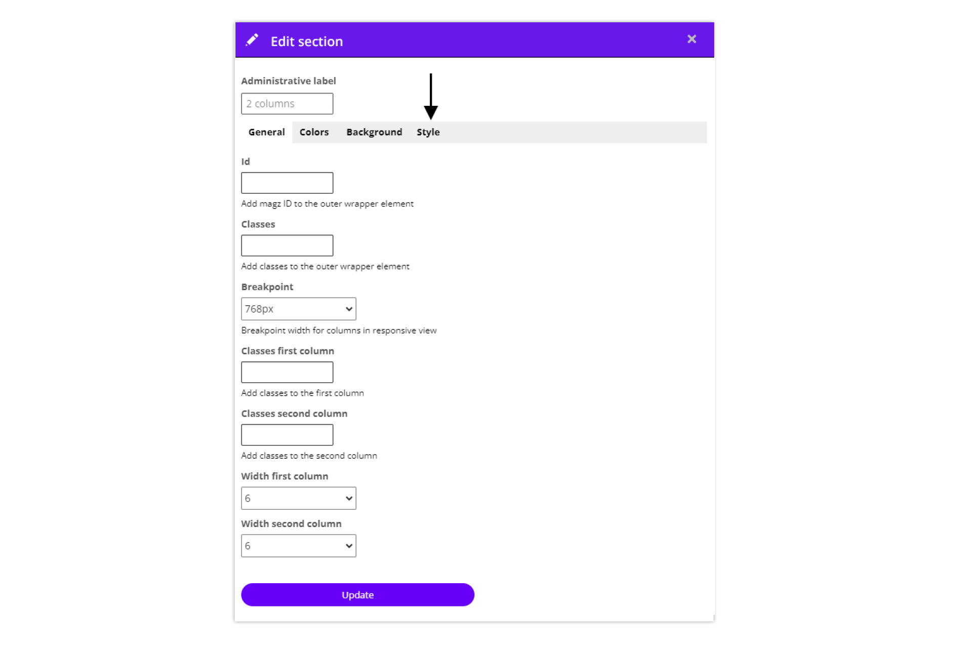
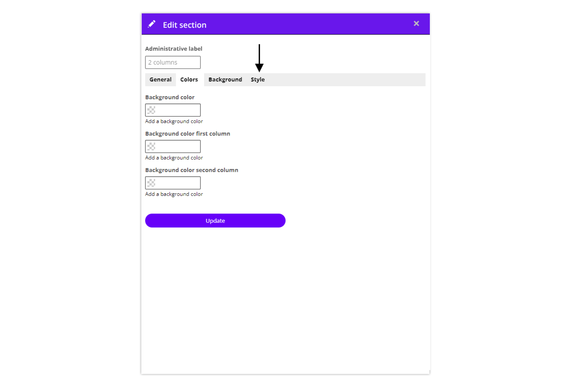
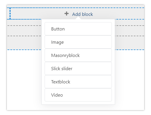
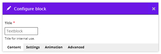
Edit a page
Divide pages into sections and place and edit content blocks
6
Text
Add and edit text, text styles, fonts

7
The Media manager
A library of your photos, videos and documents
8
Image
Add, replace or edit a photo
9
Video
Add, replace or edit a video
10
Size and position
How do you determine the size and position of a content block and what does that look like in responsive?
11
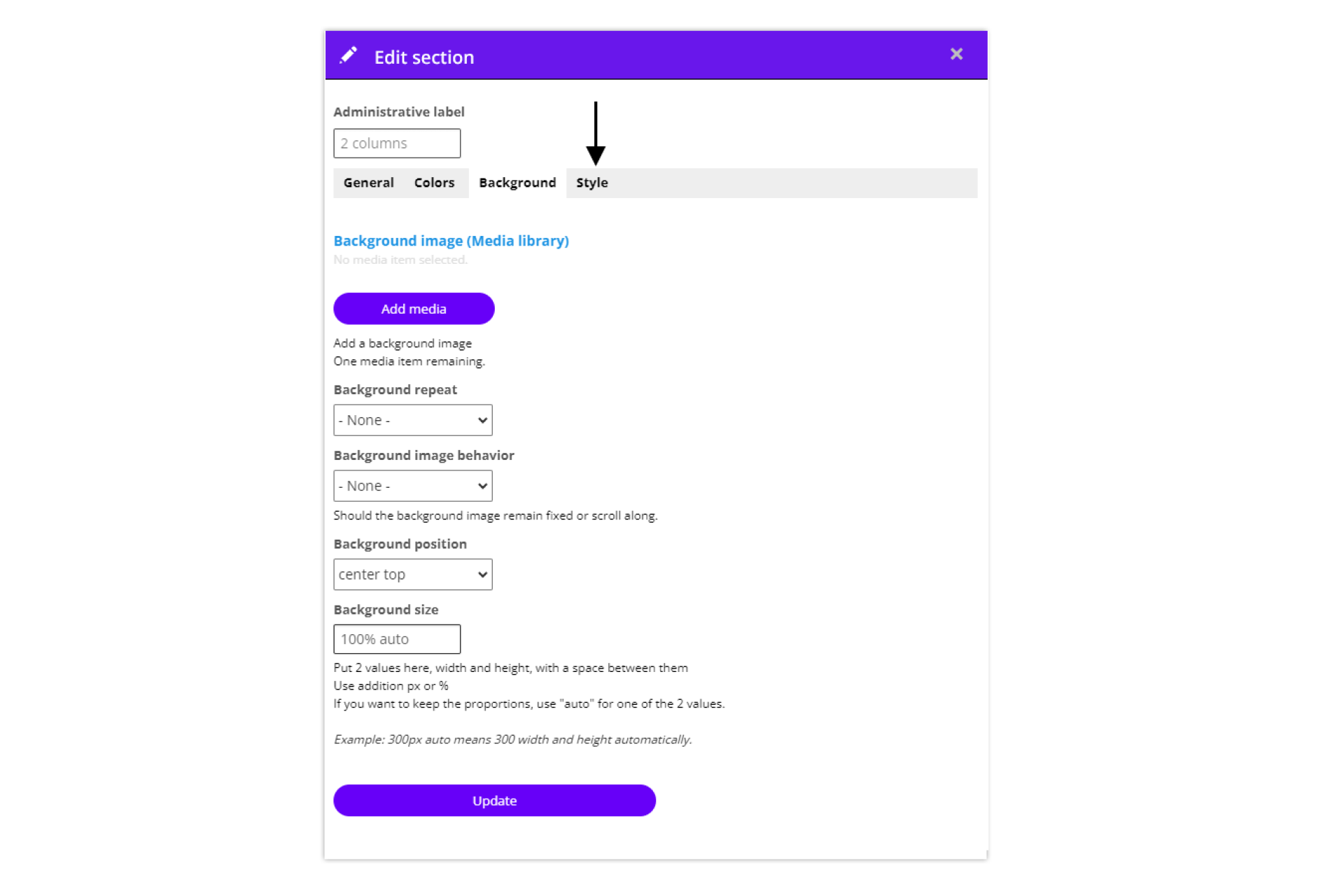
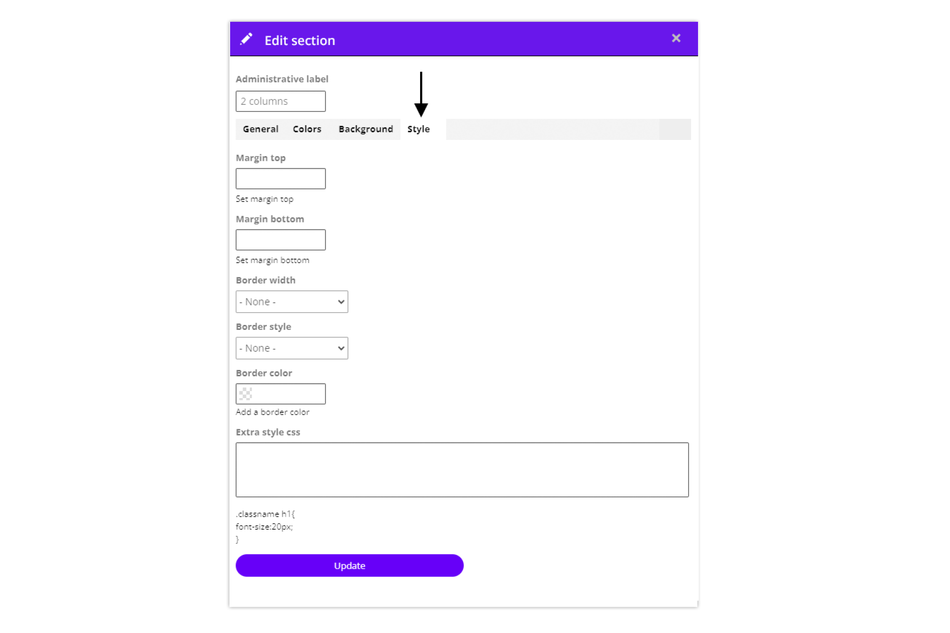
Backgrounds
Achtergrond foto, video en kleur voor de pagina of de sectie
12
Photo albums
Photo slider (photos next to each other) and Masonry (collage of photos in rows below each other)
13
Hidden content on the page
Hidden content in fold-out, popup or overlay
14
Publish
Publish (and unpublish) an edition or page and set up the kiosk
15
Tips
Helpful tips, frequently asked questions and blogs