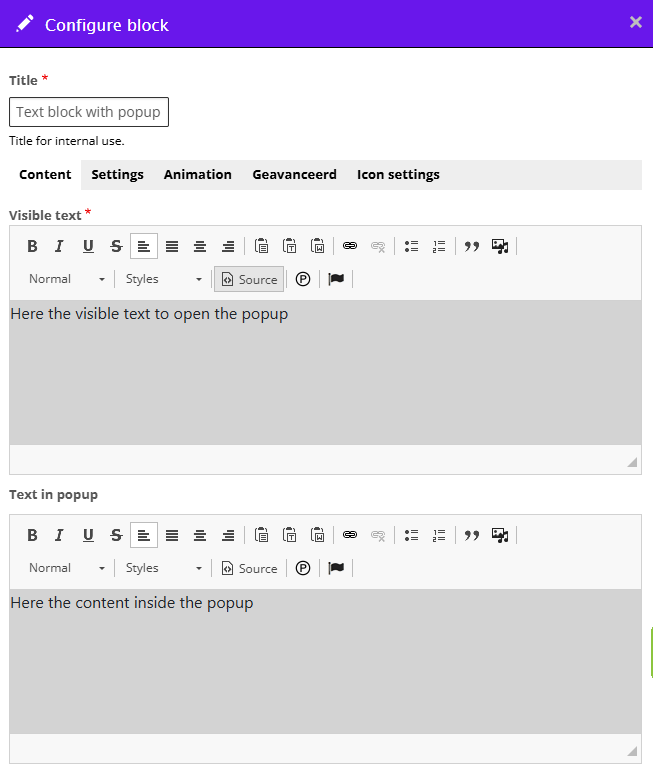
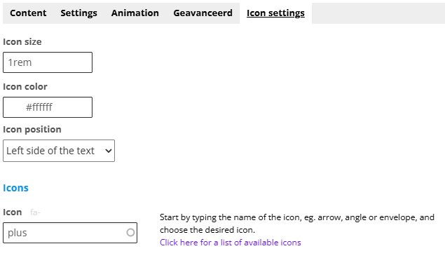
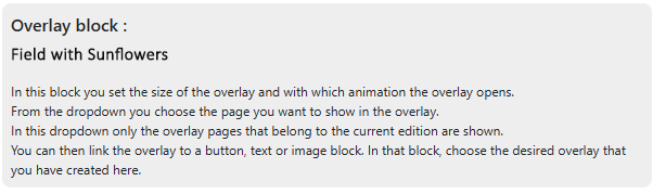
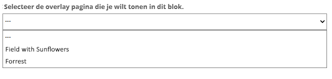
690, 691 Copying and creating a template , Copy edition
Logo Magzmaker


Additional information on the page

Present large amounts of content clearly without the page looking unnecessarily long or busy. This can be done with a hidden content block that becomes visible when the user clicks on it, for example a fold-out block.

Box with chocolat


Text with foldout

With an foldout functionality, users can toggle information open and closed. This provides an elegant way to present large amounts of content in an organized manner without making the page unnecessarily long or cluttered.

An expandable block typically consists of a header (the title or question) and a hidden content area that becomes visible when the user clicks on it. This is especially useful for things like frequently asked questions (FAQs), product details, or step-by-step instructions.

  • Start adding a section
    Click here for more information about adding a section
  • Within a section, click + Add block and choose the content block Textblock with foldout.
  • Under the Content tab, you’ll see an editing field for the visible text and another one below for the hidden text in the foldout.
Edit screen: text with foldout

Formatting

You can format the text using headings, styles, links, and images, just like in a regular text block (Click here for more information about editing text)

Under the Settings tab, there is an additional field for Backgroundcolor which lets you change the background color of the expandable section. To give the content in the expandable area some extra space when a background color is applied, you can add extra spacing under the Padding foldout.

Icon settings

To indicate that a piece of text can be expanded to reveal more information, you can use an arrow icon, for example   to collapse again.

In the Icon Settings, you can configure which arrows you want to use, their color, size, and position.

  • Icon Size: Enter a value (px, rem)
  • Icon Color: Choose a color or paste the hex code into the field
  • Icon Alignment: You can choose left, right, or centered (only available when the icon position is set to “Bottom”)
  • Icon Position:
    -
    Inline (on the same line) – This determines whether the arrow icon is shown to the left or right of the text
    -
    Bottom - This places the arrow icon below the text. It can be centered, left-aligned, or right-aligned beneath the text
  • The type of icon is set under Icon roll down / Icon roll up. Start typing the name of the icon (e.g., arrow, angle) and select the desired icon. Click here for a list of available icons.
Text with fold-out - icon settings

Examples text with foldout

This is Question 1

In the fold-out the answer to question 1 
Lorem ipsum dolor sit amet, consectetur adipiscing elit. In ultrices aliquet pulvinar. Phasellus pulvinar quis dolor at tempor. Vivamus sed condimentum lacus, ac volutpat massa. Duis est felis, imperdiet ut risus non, sollicitudin malesuada dui. Pellentesque vitae risus mattis, lacinia lectus non, sagittis turpis.

The secins question

In ultrices aliquet pulvinar. Phasellus pulvinar quis dolor at tempor. Vivamus sed condimentum lacus, ac volutpat massa. Duis est felis, imperdiet ut risus non, sollicitudin malesuada dui. Pellentesque vitae risus mattis, lacinia lectus non, sagittis turpis.

This is question 3

Vivamus sed condimentum lacus, ac volutpat massa. Duis est felis, imperdiet ut risus non, sollicitudin malesuada dui. Pellentesque vitae risus mattis, lacinia lectus non, sagittis turpis. Lorem ipsum dolor sit amet, consectetur adipiscing elit. In ultrices aliquet pulvinar. Phasellus pulvinar quis dolor at tempor.

You can place a Textblock with fold-out between the text so that the text on the page remains compact but you can still provide more background information.

Extra information about the subject you will find here

The extra information in the foldout

Afbeelding
Box with chocolat

Lorem ipsum dolor sit amet, consectetur adipiscing elit. In ultrices aliquet pulvinar. Phasellus pulvinar quis dolor at tempor. Vivamus sed condimentum lacus, ac volutpat massa. Duis est felis, imperdiet ut risus non, sollicitudin malesuada dui. Pellentesque vitae risus mattis, lacinia lectus non, sagittis turpis.

Read more

Text with popup

With a pop-up, you can display background information that is not immediately visible on the page. This ensures that the page remains organized without becoming unnecessarily long or cluttered.

The functionality works largely the same as the block "Text with fold-out": a part consisting of a title or a short piece of text and another part that becomes visible when the user clicks on the text.

  • Start adding a section
    Click here for more information about adding a section
  • Within a section, click + Add block and choose the content block Textblock with popup.
  • Under the Content tab, you’ll see an editing field for the visible text and another one below for the hidden text in the popup.
Edit screen: text with popup

Formatting

You can format both the text in the visible block and in the popup with a heading, styles, links, and images, just like in a regular text block (click here for more information about editing text).

Under the settings tab, you can specify how wide the popup should be under Popup width (25%, 50%, or 75%).
To give the content in the popup some extra space up to the edge of the popup, you can add extra padding under the heading Padding popup (set to 20px by default).

To set the background color, expand the BACKGROUND settings.
Background color - assigns a background to the visible part (set some padding as well)
Popup background color - with this setting you can optionally determine a different color for the popup. By default, the color is set to white #fffff; choose another color as desired or leave the field empty to keep the popup background transparent. This can sometimes be nice with large text or with an image with a transparent background.

Iconsettings

To indicate that you can open a piece of text to see more information, you can use an icon, for example +.
In the icon settings, you can set which icon you want (the plus-circle icon is set by default).

  • Icoon size: enter a value (px, rem) - 1.0 rem is set as the default
  • Icon color: choose a color or paste the color number into the field
  • Icon positie:
    - Left side of the text
    - Right right of the text (set as default)
    - Above the text
    - Below the text
  • Icon: set the icon type (plus circle  is set as the default): Start typing the name of the icon, e.g. plus, arrow, angle, which will show you a number of suggestions, and choose the desired icon. Click here for a list of the available icons
Edit screen: text with popup icon settings

Examples text with popup

Overlay

Available for Professional Publisher license

An overlay is a page that (partially) covers the existing page. The overlay slides over the page from the side or bottom, for example.


1. Creating an overlay page

Go to the page overview of the edition where the overlay page is to appear.At the top, you will see a button labeled "Create new overlay page".

Create a separate page for the content displayed in the overlay.

  • Create new overlay page - You create an overlay page from the page overview. Go to the page overview and select "Create new overlay page" at the top to create content for a new overlay.
  • Edit a page - You can edit it in exactly the same way as for regular pages. You can insert all types of content blocks and sections.
  • Overlay background - PLEASE NOTE: the background is transparent by default (you see it as a white background). Transparency can sometimes be used to display something as a standalone image. If you want a white background for the overlay, make the background color white (or another color) via the page settings of the overlay page (you can open page settings via the purple bar at the top of the overlay page or via the purple button behind the overlay page in the overlay overview).
Edition overview - create new overlay page

Afbeelding
Tabs Pages | Overlay pages

2. Editing an existing overlay page

  • In the page overview, you will see Pages | Overlay pages in the top right.
  • Under 'Overlay pages', you will find the created overlay pages and you can edit the pages.
     

3. Adding the "Overlay Layout" helper block

The Overlay Layout block is only a helper block; you will not see it in the published or preview version. With this helper block, you set the characteristics of the overlay, such as the size of the overlay, from which side the overlay slides across the page, and which overlay page should be displayed.

  • Make sure you have first created an overlay page as described in point 1. Now you can add the overlay to a page. It doesn't matter where you place the block. You can place the block at the very top of the page or right next to the content block (text, image, or button) from which you want to open the overlay.
  • Go to the page where you want to open the overlay.
  • Within a section, click + Add block and select the Overlay formatting content block.
  • The block appears as a gray block on the page.
  • A "Overlay Layout" block is only intended for making settings.
    Afbeelding
    Overlay Layout block


What you can set:

4. Settings

Content tab

  • Overlay width / Overlay height - specify a percentage for the height and width of the overlay
  • Overlay behavior - the way the overlay slides over the existing page (from the left, right, bottom, or top)
  • Which overlay page do you want to display - At the bottom, you will see a dropdown showing the available overlay pages you created earlier. Select the desired page. Once you have selected the page, its name will be displayed in the block.
    Afbeelding
    overlay opmaakblok dropdown

Settings tab

  • Close button background color - Under the Settings tab, you set the color of the icon used to close the overlay.

Advances tab

  • Border or rounded corners - Under the Advanced tab, you can add a border or rounded corners around the overlay. You can also place a border only on the side where you need to close the overlay, so that this area is emphasized more.


5. Linking an overlay page to a content block

  • Once you have created both the overlay page and the Overlay Layout block, you can link them to a content block on the page.
  • You can link an overlay to various content blocks: a text block, an image block, or a button. In these blocks, you will see the heading OVERLAY; expand this section and select the desired overlay from the dropdown.


Copying and creating a template

You can read how creating a template, a copy of a page containing an overlay, and a copy of an entire edition containing overlays works in the examples below.
 

Overlay block :
Copying and creating a template

In this block you set the size of the overlay and with which animation the overlay opens. From the dropdown you choose the page you want to show in the overlay. In this dropdown only the overlay pages that belong to the current edition are shown. You can then link the overlay to a button, text or image block. In that block, choose the desired overlay that you have created here.

Copy a page or create a template

When copying a page or creating a template, all formatting blocks with the settings are retained; however, all links to overlay pages are broken, and you can create new links.


Overlay block :
Copy edition

In this block you set the size of the overlay and with which animation the overlay opens. From the dropdown you choose the page you want to show in the overlay. In this dropdown only the overlay pages that belong to the current edition are shown. You can then link the overlay to a button, text or image block. In that block, choose the desired overlay that you have created here.

Copying an entire edition

When copying an entire edition, all pages and all overlay pages are copied along with it, and all links are broken.

You can rename the copied overlay pages, modify the content, and then link them back to the content blocks on the page.