

690, 691 Copying and creating a template , Copy edition
Logo Magzmaker


Accessibility of your publication

We believe it is important that online publications created with Magzmaker are accessible to everyone. The Magzmaker platform’s technology supports various aspects of accessibility, and we make improvements where necessary. However, the publication's content is provided and structured by you, the user.

Therefore, it is a good idea to keep accessibility in mind when placing and designing your content.

Two Keys

Checklist

  • Do images have appropriate alt text?
  • Is the heading structure logical?
  • Are links and buttons clearly described?
  • Is there sufficient color contrast?
  • Are PDFs identifiable as such?
  • Do videos have subtitles?
  • Are tables structured correctly?

Images


Use good alt text
Provide images with short, clear alt text. Describe what is visible in the image and what is relevant to the reader.

Good alt text does not merely describe the literal content of the image; above all, it conveys the information the image adds to the content.

Voorbeeld

  Not good: Photo 1

  Better: Three employees are looking at the results together on a laptop.

Drie medewerkers bekijken de resultaten op een laptop

Adding alt text in MagzmakerWhen uploading an image in Magzmaker, you are required to enter alternative text. This text is used by assistive technologies such as screen readers.

Headings and text structure

Use headings to structure your content logically.

Start with a single H1 as the page's main title, then use H2, H3, and so on for subsections.

Do not use headings solely to make text larger or more prominent. A heading also informs users of assistive technology about the page's information structure.

Good:

H1
→ H2
→ H2
→ H3
→ H2

Avoid a structure where, for example, an H3 appears directly beneath an H1 without a clear reason.
If you want to make a subheading smaller, choose the H2 tag and reduce its size using a class (e.g., 80%) from the "Style" dropdown list.
For a lead-in line above a heading, it is better to use a class that increases the size (e.g., 120%).

Adding headings in MagzmakerIn the text editor, select the text you want to format as a heading. Choose the appropriate heading from the "Format" dropdown menu.
You can adjust the size of text positioned above or below a heading by using a class from the "Style" dropdown; simply select the text and choose one of the preset classes for increasing or decreasing the size.
If the desired size isn't available, you can add your own classes with the required sizes (only with a Professional Publisher subscription) or ask us to add them for you.

Links and buttons

Use clear and meaningful text for links and buttons.

Users should be able to understand where a link leads or what a button does.

Example

  Less clear: Click here

  Clearer: View the 2025 annual report

Gebruik ook geen linktekst die alleen uit een URL bestaat wanneer een duidelijke omschrijving mogelijk is.

Links that open in a new tab
Make it clear when a link opens in a new tab. You can do this, for example, using an icon   and a text label that is also accessible to screen reader users.

Links to PDF files
Indicate when a link points to a PDF. For example: Download the 2025 annual report (PDF)

Configuring the external link icon   in Magzmaker
In the edition settings, you can choose whether to display the icon for external links. The icon will then automatically appear next to every external link. Read the 'Editions' page to learn how to configure the icon.

Color and contrast

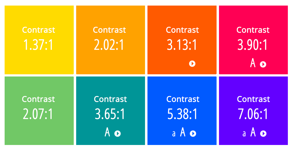
Ensure sufficient contrast between text and background.

For standard text, WCAG 2.2 AA requires a minimum contrast ratio of 4.5:1. Different contrast requirements apply to large text.

Consider not only the color of the text itself but also text appearing on images and buttons.

Furthermore, do not use color as the sole means of conveying information.

Voorbeeld van kleurcontrast van tekst op verschillende gekleurde ondergrond

Want to check color contrast?
There are various websites where you can check whether the color contrast between text and background is sufficient. For example contrast checker.

Font and text

Choose a highly readable font and ensure adequate text size and line spacing.

Use different fonts and styles sparingly. A clear typographic hierarchy helps users quickly grasp the content.

Also, ensure that information is not conveyed solely through means such as color, bold text, or larger font sizes.

Write text as clearly and simply as possible.

Use:

  • short paragraphs
  • clear subheadings
  • bulleted lists when they improve readability

Use text as text
Ideally, present text as actual text rather than as part of an image. Text within an image may be less accessible to screen reader users and harder to read when the page is magnified.

Do you want to place text over an image? Whenever possible, use a text block overlaid on the image instead of incorporating the text into the image itself.

Tables

Use a table only when the information actually has a tabular structure.

Use clear column headers and, where necessary, row headers. Ensure that the relationship between the data remains clear.

Therefore, do not use a table solely to align text or images on the page.

For a proper foundation for an accessible table, these are the key elements:

  • <caption> for the table title/description
    You can hide its display using CSS
  • <thead> for the column headers
  • <th scope="col"> to indicate that these are column headers
  • <tbody> for the data
  • <td> for the data cells

Use clear table headers
If the top row is a column header, use `scope="col"`.
When the first cell of the left-hand row acts as a row header, use `scope="row"`.

If necessary, provide the table with a `<caption>` containing a brief description of the table's subject.
If a title is already present, you can visually hide the caption using CSS.

The table then looks like this:

Naam van de table
Date Subject Finished
10-04-2027 Project A july 2027
15-05-2027 Project B End 2027

You can use the example code below in a text block. Click "Source code" in the text editor and paste the code in. Click "Source code" again to return to the visual view.

<table class="table-container">
<caption class="visually-hidden">Planning 2027</caption>
<thead>
<tr>
<th scope="col">Date</th>
<th scope="col">Subject</th>
<th scope="col">Finished</th>
</tr>
</thead>
<tbody>
<tr>
<td>10-04-2027</td>
<td>Project A</td>
<td>july 2027</td>
</tr>
<tr>
<td>15-05-2027</td>
<td>Project B</td>
<td>End 2027</td>
</tr>
</tbody>
</table>

Video and audio

Ensure that important information from video and audio is also accessible to users who cannot hear or see it.

Examples include:

  • subtitles for videos;
  • a transcript or text-based version of spoken information;
  • audio description when important visual information is not conveyed by the spoken text.


Animations and movement

Use animations and moving elements sparingly.

Movement should not make the content unnecessarily difficult to read or use. Also, consider users who are sensitive to movement.

Do not use rapidly flashing elements.

If you have a question about the accessibility of your publication or need advice on creating it, please feel free to contact us.